Fonts Art - Keyboard Fonts
- 4.5
- Rating
- 10.00M
- Installs
- Free
- Price
 Analysis by App-foxy
I like customization apps most when they solve a small, everyday problem without turning my phone into a project. Fonts Art - Keyboard Fonts aims at exactly that: it gives your typing a more decorative look and adds tools for changing the visual style of text. I tested it as a personalization app rather than treating it like a simple font viewer, and my overall impression is that it is most useful for people who regularly post on social platforms, write captions, or want a keyboard that feels less ordinary.
The important distinction is that this is not just about changing the appearance of the system interface. Its appeal is the writing workflow: choose a style, type with it, and use the result in places where stylized characters are accepted. That makes it more practical than a wallpaper-only customization tool, but also more dependent on the app or service where the text is pasted. The best results come when you treat Fonts Art as a text-style tool, not as a universal redesign for every screen on your phone.
It is free to install, and AIBY Inc. is the developer behind it. The app is aimed at Everyone, so its basic concept is easy to understand for a wide audience. It has reached over 10 million installs and holds a 4.5 average from around 418 thousand ratings, which suggests that the idea has broad appeal. In my experience, though, popularity does not remove the need for a little setup care, especially if you expect every font to behave identically in every app.
You May Also Like

 Blood Strike: 2.5 Anniversary
Blood Strike’s Loadouts Turn Every Drop Into a Tactical Gamble
A close look at Blood Strike’s custom loadouts: how fast access to signature weapons reshapes its battle royale rhythm, rewards preparation, and narrows the gap between fights.

 Pandora - Music & Podcasts
Pandora’s Music Is Easy to Start, but Harder to Recover
Pandora’s strength is its low-effort path from a seed to a station. Its weak spot is how much confidence it asks you to place in connection, setup, and quiet recovery.

 8 Ball Pool
 Is Built on Rivalries, Rematches, and Routine
A close look at the rivalries, rematches, shared routines, and unanswered safety questions that turn a quick pool match into a persistent mobile community.

 Samsung Music
’s Quiet Strength Is Playing What You Already Own
Its reach comes less from spectacle than from dependable access to a personal library. That simplicity is both the app’s strongest retention engine and its ceiling.

 AccuWeather: Weather Radar
AccuWeather Review: A Quick, Clear Forecast for Everyday Decisions
For everyday plans, the best forecast is the one you can understand quickly. AccuWeather makes rain timing, radar, and local conditions easy to act on, with a few trade-offs.

 Hill Climb Racing
Why Hill Climb Racing Still Turns Crashes Into One More Run
A tiny car, a bumpy hill and one more upgrade: Hill Climb Racing keeps resurfacing because its simple chaos makes every near-miss feel personal.
More From Our News Desk



Where the experience usually gets stuck
The first point of friction is usually the difference between seeing a font preview and actually using that font while writing. A preview can look perfect inside a customization app, while the destination app may display the characters differently, replace them, or ignore part of the styling. This is not necessarily a failure in Fonts Art. Decorative text often relies on special characters, and support depends on the receiving app, the device, and the way the text is inserted.
I would therefore test a style in a harmless draft before using it for an important post, message, profile description, or invitation. Type a short phrase, copy or insert it into the intended destination, and check how it appears after sending or saving. A font that looks attractive in a social caption may be less readable in a long paragraph, and some elaborate styles can make search, selection, or editing harder.
Another common sticking point is expecting the keyboard to behave exactly like the phone’s original keyboard. A specialized keyboard can change the visual writing experience, but it may not match the familiar layout, autocorrection behavior, language handling, or shortcut habits you already use. If you type quickly for work, you may notice the difference immediately. If you mainly create short captions or decorative replies, the trade-off is much easier to accept.
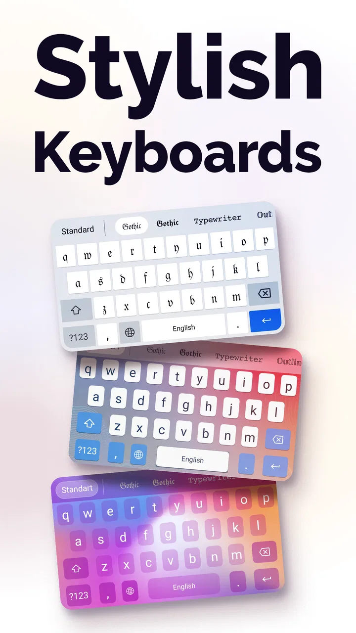
The app’s store summary focuses on custom fonts, keyboard themes, symbols, and font changing for Instagram. That tells me where its strongest use case lies: short-form, visual communication. I would not choose it as my only keyboard if my priority were rapid professional writing, technical notes, or long documents. I would use it as a creative option that I can switch to when appearance matters more than speed.
There is also a subtle readability problem. A font can look stylish in a name or headline but become tiring when used repeatedly. I found it more sensible to reserve striking styles for a short phrase, then keep the rest plain. This creates contrast and reduces the chance that friends will have difficulty reading the message. The most decorative option is rarely the most useful one.
Why a successful preview can still fail elsewhere
Text styling is not the same as installing a new typeface across every app. In many cases, the result is created through alternate characters rather than by forcing a universal font change. That explains why a styled phrase may travel successfully into one service but look ordinary or inconsistent in another. It also explains why a recipient may see a different result from the one shown on your screen.
For social posts, I recommend checking the final composition after insertion. Pay attention to line breaks, spacing, emoji placement, and whether symbols remain visible. A decorative character can affect where a caption wraps, so a carefully arranged line may look different once published. This is a practical reason to keep a plain-text copy of anything important before experimenting with a more elaborate style.
Setup checks that save time
The initial setup deserves more attention than the colorful previews suggest. If Fonts Art offers a keyboard-based workflow on your device, follow the operating system’s keyboard setup screens carefully and read each step before continuing. The goal is not to rush through the process, but to make sure the keyboard is enabled and selected when you actually want to use it.
On a phone with more than one keyboard, switching can be the source of confusion. You may think the font feature is not working when the standard keyboard is still active. Before troubleshooting the app itself, open a simple text field and confirm which keyboard is currently selected. If the ordinary keyboard appears, change the input method using the controls provided by your operating system, then test again in a short note.
Do not judge the setup only inside a social media app. A basic notes field or message draft is a better first test because it removes some of the destination app’s formatting behavior. Once the style appears correctly there, try the platform where you actually plan to use it. This two-step check separates keyboard setup problems from compatibility problems.
Language is another practical consideration. If you write in more than one language, test each one rather than assuming a selected style will handle every alphabet equally. Decorative character sets can be uneven: a style may transform common Latin letters attractively while leaving other characters unchanged. That mixed appearance may be exactly what you want, or it may look accidental in a multilingual caption.
Symbols deserve their own check. They can add personality to a profile line or short announcement, but they may also change the visual balance of a sentence. I prefer to add them after writing the main text, not before. That makes it easier to remove a symbol if it interferes with spacing or readability, and it keeps the message understandable even if the destination app treats the symbol differently.
It is also worth checking the app’s current state before assuming that an old setup guide still applies. The current version is 2.78.8, and interface details can change over time. If a button has moved or a setup label looks different, use the wording shown on your own device rather than following an outdated screenshot. The general principle remains simple: select a style, confirm the active input method, and test in a plain text field.
How I would prepare it for a real posting routine
For a regular Instagram workflow, I would create a small personal routine. First, write the caption normally. Second, save a plain version somewhere temporary. Third, apply styling only to the short parts that need emphasis, such as a heading, call to action, or username-like phrase. Finally, inspect the complete caption after insertion, including the line breaks. This is faster and safer than composing the entire post in an unfamiliar keyboard.
That approach also makes editing easier. If you later change one sentence, you can work from the readable original instead of trying to decode a heavily stylized block. It is a small habit, but it prevents the most annoying consequence of decorative typing: losing track of what you wrote.
Recovering the workflow when something goes wrong
When a style does not appear, I would troubleshoot in a fixed order rather than repeatedly tapping the same option. First, check whether the Fonts Art keyboard is actually active. Second, try a plain text field. Third, test a different style. Fourth, paste the result into the intended app. Each step answers a different question and helps identify where the problem begins.
If the text works in a note but not in a particular social app, the destination is the likely source of the limitation. If no style works anywhere, revisit the keyboard selection and setup screens. If only one style fails, choose another style instead of treating the entire app as broken. This kind of isolation is especially useful because decorative text is not a single feature with a single failure point.
When the keyboard feels awkward, I would not immediately uninstall it. Try using it only for short phrases and return to the usual keyboard for longer writing. This hybrid workflow is one of the most practical ways to use a personalization keyboard. It preserves the speed and familiarity of your normal input method while still giving you access to Fonts Art when you want a visual accent.
Copy-and-paste is another recovery route when direct keyboard use becomes inconvenient. Compose the phrase in the app’s available font workflow, copy it, and insert it into the destination. This can be slower, but it may be preferable for a single profile update or caption. It also lets you compare the styled version with the original before publishing.
If the app behaves differently after an operating system update, start with the basic checks again: confirm the active keyboard, reopen the app, and test in a simple field. I would avoid making several changes at once, because then it becomes impossible to know which action fixed the issue. A calm, one-step-at-a-time approach is more effective than repeatedly reinstalling everything.
In-app purchases range from $0.99 to $49.99 per item. I would explore the free experience first and decide whether the extra customization is genuinely useful before paying. Someone who only wants occasional decorative captions may have no reason to spend more, while a frequent creator may value additional styles or themes enough to consider them. The right choice depends on how often the app becomes part of your routine, not on how many previews catch your eye.
When the app is not the cause
Some problems are created by the receiving platform. A social network may normalize text, change spacing, restrict certain characters, or display unsupported symbols as empty boxes. A messaging app may also render the same characters differently from the preview. If the text looks correct in a basic note but changes after posting, that is a strong sign that the destination is interpreting it differently.
The recipient’s device matters too. Even when a service accepts the characters, the other person’s operating system or app version may show a substitute glyph. For important information such as an address, appointment detail, or customer instruction, I would always keep the wording plain. Fonts Art is best for expression, not for text where perfect readability and universal display are essential.
There is a similar distinction between an app problem and a typing habit. If you accidentally leave a decorative keyboard active, ordinary messages can become slower or look unusual. I recommend switching back after finishing a caption-heavy task. That small step prevents confusion the next time you open a banking form, work email, or long note.
Privacy and comfort also deserve practical attention whenever a user adds a keyboard. I would read the operating system’s setup messages and only enable what I understand. If you feel uncomfortable using a specialized keyboard for sensitive information, keep your regular keyboard for passwords, financial details, and private notes. Fonts Art can remain a creative tool without becoming the input method for everything you type.
This is where the app differs from a conventional font installer or a simple wallpaper customization tool. A font installer may be better if your goal is changing typography inside a specific design application. A standard keyboard is better for speed, prediction, and dependable everyday writing. Fonts Art sits between those choices: it is more expressive than the default keyboard, but less universally reliable than ordinary text input.
Who will enjoy it, and who should skip it
I think it suits social media users, casual creators, people who enjoy updating profile text, and anyone who wants a quick way to make a short message feel personal. It can also be useful for a themed event, a playful announcement, or a caption where visual tone matters as much as the words. The fact that it is free to start makes experimenting relatively easy.
I would be more cautious recommending it to someone who writes long documents, needs consistent typography across devices, or relies heavily on fast autocorrection. It is also not the right tool for accessibility-sensitive communication if an ornate style makes the text harder to read. In those situations, a familiar keyboard or a dedicated design app is likely the better option.
Parents may appreciate that the content rating is Everyone, but that does not mean every decorative style is suitable for every communication purpose. The app’s age classification describes its general audience; it does not remove the need to choose readable, appropriate text when posting publicly or messaging others.
My practical verdict after using it
Fonts Art - Keyboard Fonts is a worthwhile personalization app when you want expressive text without opening a full graphic design program. Its strongest quality is convenience: it brings fonts, symbols, and keyboard styling into a workflow that can fit naturally around captions and short messages. I especially like the option of using it selectively instead of committing to a completely different typing habit.
Its main limitation is also clear. The result is not guaranteed to look identical everywhere, and the keyboard may not replace a standard input method comfortably for every user. The app works best when you understand that compatibility, readability, and editing convenience matter as much as the visual effect.
With around 7.7 thousand written reviews and a large user base, it is easy to see why the concept attracts attention, but I would still judge it by your own routine. Try a few styles, test them in the exact apps you use, and keep plain copies of important text. That approach gives you the creative benefit without letting a decorative font create avoidable problems.
My recommendation is simple: install it if you want occasional personality in social posts, profile text, or short messages, and use the regular keyboard when speed and reliability come first. Skip it if you need a universal font change, flawless cross-device typography, or a keyboard optimized for long-form productivity. Used within those boundaries, this free personalization app from AIBY Inc. is a fun and practical addition rather than a replacement for every writing tool on your phone.
FAQs for Fonts Art - Keyboard Fonts
01What is Fonts Art - Keyboard Fonts and how does it work?
Fonts Art - Keyboard Fonts is a mobile application that allows users to customize their text with a variety of stylish fonts. It integrates seamlessly with your device's keyboard, enabling you to switch fonts easily while typing in any app. Simply install the app, follow the setup instructions, and start expressing yourself with unique typography.
02Is Fonts Art - Keyboard Fonts free to use, or are there in-app purchases?
While Fonts Art - Keyboard Fonts offers a free version with basic features, it also includes in-app purchases for premium fonts and additional customization options. Users can choose to upgrade to unlock exclusive content and remove ads, enhancing their overall experience with a broader selection of fonts.
03Can Fonts Art - Keyboard Fonts be used across all applications on my device?
Yes, Fonts Art - Keyboard Fonts is designed to work with most apps on your Android or iOS device. Once installed, the custom keyboard can be used in messaging apps, social media platforms, and any other application where text input is supported, offering a consistent experience across the board.
04Is Fonts Art - Keyboard Fonts safe to use in terms of privacy and security?
Fonts Art - Keyboard Fonts prioritizes user privacy and security. The app requires access to your keyboard settings to function, but it does not store or transmit any personal information or keystrokes. Always ensure you're downloading the app from a reputable source to maintain security.
05How do I troubleshoot if Fonts Art - Keyboard Fonts is not working properly?
If you're experiencing issues with Fonts Art - Keyboard Fonts, first ensure that the app and your device's operating system are updated to the latest versions. Restart your device and check the app's permissions in your settings. If problems persist, consult the app's help section or contact customer support for further assistance.
Pros
- Wide variety of stylish fonts available.
- Easy to switch between fonts in-app.
- Integrates seamlessly with social media apps.
- User-friendly interface for quick learning.
- Regular updates with new font options.
Cons
- Some features require in-app purchases.
- Can drain battery with prolonged use.
- Occasional ads disrupt the experience.
- Limited customization for free users.
- May slow down older devices.

Fonts Art - Keyboard Fonts
Gallery